Color Palettes: The Complete Guide to Choosing Home Decor Colors
Master the art of color selection for your home. From color theory to practical paint application, discover how to create beautiful, harmonious spaces that reflect your personal style.
Start Your Painting ProjectUnderstanding Color Palettes: Choosing the right colors for your home is one of the most impactful design decisions you'll make. This guide covers everything from basic color theory and psychology to practical application tips for every room in your house.
What Are Color Palettes and Why Do They Matter?
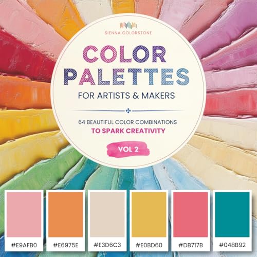
A color palette is a carefully selected combination of colors that work together to create a cohesive and visually appealing design. In home decor, your color palette sets the mood, defines the style, and can even affect how spacious a room feels. Understanding how to choose and apply color palettes is an essential skill for any DIY enthusiast or homeowner planning a renovation.
Color palettes go beyond simply picking a favorite color. They involve understanding the relationships between colors, how light interacts with them, and the psychological effects they have on mood and perception. Whether you're planning a full home renovation or just refreshing a single room, starting with a well-planned color palette ensures a professional-looking result.
For those new to design, the concept of color palettes can seem overwhelming. However, by understanding a few basic principles, you can confidently select colors that will transform your space. This guide will walk you through everything from interior painting techniques to creating accent walls that pop.
Understanding Color Theory Fundamentals
Color theory is the foundation of every successful color palette. The color wheel is your roadmap to understanding how colors relate to each other and how to combine them effectively.
The Color Wheel
The color wheel consists of primary colors (red, blue, yellow), secondary colors (green, orange, purple), and tertiary colors created by mixing primary and secondary colors. Understanding these relationships helps you create harmonious combinations.
Color Relationships
There are several key color relationships used in design:
- Complementary Colors: Opposite on the color wheel (e.g., blue and orange). These create vibrant, high-contrast combinations.
- Analogous Colors: Adjacent on the color wheel (e.g., blue, blue-green, green). These create serene, comfortable designs.
- Monochromatic Colors: Different shades and tints of the same color. This creates a sophisticated, cohesive look.
- Triadic Colors: Three colors evenly spaced on the color wheel. This creates a balanced, vibrant palette.
Understanding these relationships is crucial when selecting paint colors for your home. You can use these principles to create anything from bold, dramatic spaces to calm, relaxing retreats.
For more inspiration on specific color applications, explore our guides on accent walls and textured finishes.
Color Psychology: How Colors Affect Mood
Colors have a profound impact on our emotions and behavior. Understanding color psychology helps you choose palettes that create the desired atmosphere in each room of your home.
Red
Energy, passion, excitement. Best for dining rooms and social spaces.
Blue
Calm, trust, serenity. Perfect for bedrooms and bathrooms.
Yellow
Happiness, optimism, warmth. Great for kitchens and entryways.
Green
Balance, nature, renewal. Excellent for living rooms and home offices.
Purple
Luxury, creativity, sophistication. Great for accent walls and bedrooms.
Orange
Energy, enthusiasm, warmth. Perfect for creative spaces and playrooms.
When selecting color palettes, consider the function of each room. A home office might benefit from calming blues and greens, while a dining room could use warm reds and oranges to stimulate conversation. Understanding these principles helps you create spaces that support their intended activities.
Practical Guide to Applying Color Palettes
Once you've chosen your colors, it's time to apply them effectively. Here are key considerations for implementing your color palette in your home.
Proportions and Balance
The 60-30-10 rule is a classic interior design principle: 60% dominant color (usually walls), 30% secondary color (furniture, rugs), and 10% accent color (accessories, artwork). This creates a balanced, visually appealing space.
Lighting and Color
Natural and artificial light significantly affect how colors appear. North-facing rooms receive cool light, making warm colors appear muted. South-facing rooms receive warm light, making cool colors appear softer. Always test paint samples in your actual space before committing.
Transitioning Between Rooms
When your home has an open floor plan, consider how colors transition between spaces. Use a cohesive color palette that flows naturally, creating a harmonious overall design.
For more detailed advice on room-by-room painting, visit our interior painting guide. If you're considering alternative finishes, learn about wallpaper installation and textured finishes.
Popular Color Palettes for Every Style
Different design styles call for different color approaches. Here are some popular palettes to inspire your next project.
Modern Farmhouse
A warm, inviting palette that combines neutral whites and grays with natural wood tones and warm earthy accents.
Coastal-Inspired
Crisp, light, and airy with soft blues, sandy neutrals, and crisp whites reminiscent of a beach house.
Jewel Tones
Rich, luxurious, and dramatic colors that add depth and sophistication to any room.
Bohemian
Eclectic, vibrant, and free-spirited with earthy tones and bold accent colors.
These palettes serve as inspiration for your own projects. Remember, the best color scheme is one that reflects your personal style and makes you feel at home. For more decorating ideas, explore our seasonal decor and home repair hacks.
Painting Tips for a Professional Finish
Once you've selected your perfect color palette, proper application is key to achieving professional results. Here are essential tips for your painting project.
Preparation is Key
Proper surface preparation ensures paint adheres well and lasts longer. Clean walls thoroughly, repair any damage, and use quality painter's tape to protect trim and adjacent surfaces.
Choose the Right Paint Sheen
Paint sheen affects both appearance and durability. Flat and matte finishes hide imperfections but are less durable. Satin and eggshell offer a balance of durability and appearance. Semi-gloss and high-gloss are most durable and easiest to clean, ideal for trim and high-traffic areas.
Application Techniques
For best results, use a combination of rolling and brushing. Cut in edges with a brush, then roll the main surface using a W pattern to ensure even coverage. Apply two coats for the most uniform finish.
Need more painting guidance? Check out our interior painting guide for comprehensive tips. If you're dealing with tricky areas, learn about wallpaper installation or textured finishes as alternatives.
Common Color Palette Mistakes and How to Avoid Them
Even experienced DIYers make mistakes with color selection. Here are the most common pitfalls and how to avoid them.
Choosing Colors in the Store
Store lighting is typically warm and can distort how colors appear. Always bring paint swatches home and view them in your space throughout the day before making a final decision.
Ignoring Existing Elements
Your color palette should work with existing elements like flooring, cabinets, and furniture. For example, if you have hardwood floors, choose paint colors that complement the wood tone.
Not Testing Before Committing
Never paint an entire room based on a tiny swatch. Purchase sample pots and paint large test patches on your walls to see how the color performs in your space.
Using Too Many Colors
While it's tempting to incorporate many colors, a palette with too many elements can feel chaotic. Stick to a maximum of 5-6 colors in your overall palette for a cohesive look.
For more advice on planning your project, read our guides on budget estimating and material estimators.
Current Color Trends vs. Timeless Palettes
Understanding the difference between trends and timeless choices helps you create a home that feels current without quickly dating itself.
Current color trends often include earth tones, warm neutrals, and muted pastels. However, classic neutrals like whites, grays, and beiges have remained popular for decades because they're versatile and adaptable.
A wise approach is to use trends for easily changeable elements like paint colors and accessories, while investing in timeless choices for major elements like flooring and cabinetry. This allows you to refresh your space with minimal cost and effort.
If you're considering a larger project, explore our home renovation guide or learn about home addition options.
Expert Tips for Perfect Color Palettes
Interior design professionals use these strategies to create stunning color palettes. Here are their most valuable tips.
- Start with your favorite piece: Use an existing rug, artwork, or fabric as inspiration for your color palette.
- Consider the 60-30-10 rule: This classic formula ensures balance and visual interest in any room.
- Use color to manipulate space: Dark colors make rooms feel smaller and cozier, while light colors create an airy, spacious feel.
- Incorporate texture: Same-color textures can add depth and interest to a monochromatic scheme.
- Don't forget the ceiling: A painted ceiling can add drama or visual height to a room.
- Consider the flow: In an open floor plan, ensure colors flow harmoniously from one space to the next.
Remember, the perfect color palette is one that makes you happy and functions well for your lifestyle. For more expert advice, check out our DIY tips and home improvement guides.
Making Your Color Palette Decision
Ready to choose your color palette? Here's a quick checklist to ensure you're making the right decision:
- Test colors in your space with natural and artificial light
- Consider the room's function and desired mood
- Coordinate with existing elements and furnishings
- Use a consistent palette for flow between rooms
- Remember the 60-30-10 rule for balance
- Don't rush – take time to evaluate your options
By following these guidelines, you'll create a beautiful, harmonious space that you'll enjoy for years to come. For additional inspiration and guidance, explore our home decor section and discover everything from curtains and drapes to wall art ideas.